 by Amelia Kohm, ACN Member
Nonprofits–both large and small–are awash in data. And every one of them faces the challenge of extracting meaning from all that data and communicating it to show their impact. The problem is that the human brain processes data at a lumbering pace. Fortunately, our brains can process well-designed visual information at lightning speed. Using visual elements (like bars, pie slices, and sloping lines) to illustrate our data can make it clear and compelling for our audience.
Nonprofits are most familiar with the humble bar chart. But there are many more visually engaging ways to capture your audience’s attention and use your data to tell a memorable story about the problems you’re addressing and the difference you’re making. Here are four ideas:
Divergent Stacked Bar Chart
You probably know what a divergent stacked bar chart is, even if you don’t call it that. It’s easier to show you than to describe it. So take a look:
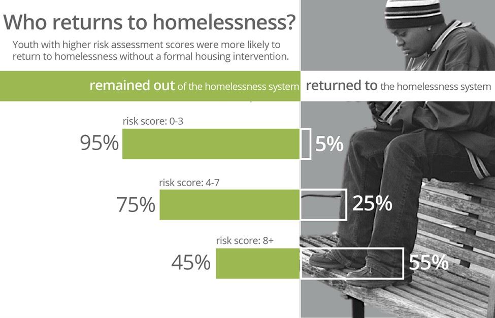
As you can see, the divergent stacked bar chart aligns each bar around a common midpoint. That makes it much easier to compare, for example, positive and negative values across categories. Divergent stacked bar charts work best when categories have an intrinsic order. For example, you might use this type of chart to show the following survey responses: Strongly disagree and disagree to the left of the midpoint and agree and strongly agree to the right. Here are directions for making divergent stacked bar charts in Excel and Tableau.
Funnel Chart
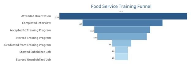
Another variation on the bar chart is the funnel chart which helps a reader visualize a process (such as the steps to complete a food service training program) where something (such as the number of participants) decreases at each step. The chart below illustrates the decreasing number of participants at each stage of a food service training program from orientation through employment. We can see at a glance how few make it all the way to a job and at which stages there is the most and least drop off.
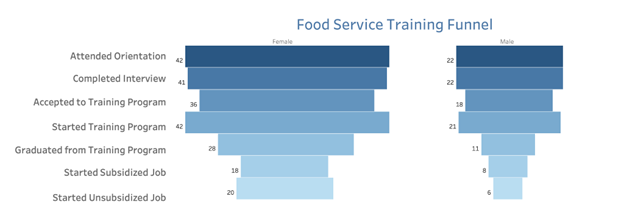
A funnel chart can be designed as interactive. This one allows users to set the display to break down the data in the chart above by gender, race and ethnicity, and other characteristics, as shown below.
Check out these easy instructions for making funnel charts in Tableau and Excel.
Combo Chart
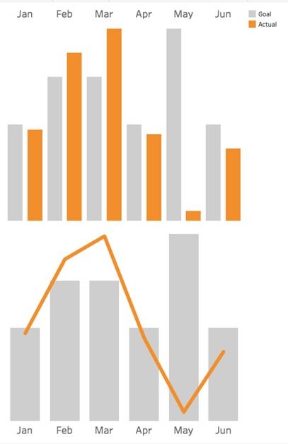
Consider the two charts below. Both show the same data: fundraising goals vs. actual funds raised. The one on top uses bars for both categories. The bottom one uses bars for the goals and lines for actual amounts.
Which works better? I vote for the bottom one. It makes comparing values between two different categories easier because it uses not only different colors to distinguish them but different “encodings” (bars and lines). The bottom chart gives us a clear view of when we are exceeding or falling short of our goals in any given month.
Combo charts are good at showing trends as well as deviations in the data that need to be examined such as the significant difference in goal vs. actual during the month of May in the example below.
Combo charts also are great at showing the relationship of two variables that have different units of measurement. In the example below, the bars show the number of participants in an afterschool program by month while the line shows the average temperature, in degrees, during each of those months.

Combo charts also are easy to create in Excel, Tableau, and other data viz applications.
Icon Chart
Another close cousin of the bar chart is the icon chart. Icon charts can work well but should be designed carefully. The icons themselves should not be used instead of bars because this makes it more difficult for viewers to make accurate comparisons. See the first example below showing how many clients live in different types of homes. It’s quite a challenge to determine how many more clients live in suburban homes vs. high rises. That’s because the height of the icons are difficult to assess.
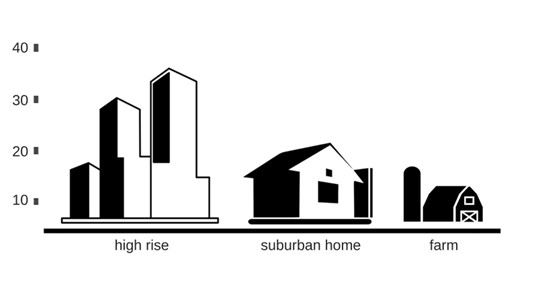
The second example makes it a little easier. But I’d argue that in both examples 1 and 2, the icons make the viewer’s job (comparing lengths) unnecessarily difficult.
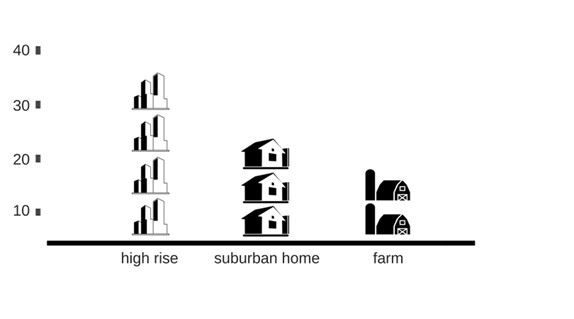
The third example, introduces bars back into the bar chart and thus requires minimal viewer effort.
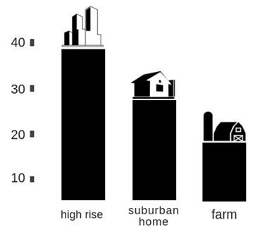
And the fourth further lightens the load by removing the Y-axis, directly labeling the bars, and placing the bars closer together.

You can add icons to bar charts in Excel and Tableau as well as in any graphics program such as Canva, which allows you to first create the bar chart and then add icons from its vast library of free images.
The divergent stacked bar chart, the funnel chart, the combo chart, and the icon chart are all great ways to clarify and engage people in your data. For other ideas on how to visualize your data, please check out the 60-Second Data Tips on my website. While you are there, you can sign up to receive a free 60-Second tip each week.
Amelia Kohm, PhD, is the founder of Data Viz for Nonprofits which helps organizations to quickly grasp their data, improve their work, and show their impact. Data Viz For Nonprofits custom designs interactive data dashboards as well as charts, maps, and graphs for presentations, reports, social media, or websites.
Amelia has more than 25 years of experience studying, funding, and evaluating human services. She earned a certificate in data visualization from the University of Washington and applied her data visualization skills in her research at Chapin Hall at the University of Chicago, a child policy research center. Prior to Chapin Hall, she worked as a program officer at the Sears Roebuck Foundation and at the Illinois Humanities Council.